Skip to content
← Selected Work

Case Study 01

Streamlining Advisor Workflows in Salesforce Service Cloud

Role — Lead UX Researcher (engagement via Capgemini) | Client — First Command Financial | Timeline — Aug 2021–Sep 2022

FintechEnterprise B2BSalesforce Lightning Design System

Financial advisors at First Command Financial were losing time to a legacy onboarding system in Salesforce Service Cloud — dense multi-tab navigation, redundant data entry, and custom UI components that broke from standard patterns. I researched and redesigned key advisor workflows within Salesforce Service Cloud, using quantitative benchmarking and qualitative discovery to identify and reduce friction in the legacy onboarding experience.

The Challenge

  • Excessive context-switching across multiple tabs
  • Redundant data entry fields slowing every onboarding task
  • Non-standard custom components that broke SLDS design patterns
  • No quantitative baseline for usability — friction was assumed, not measured

Approach

  1. 01

    Quantitative benchmarking — SUS assessments and time-on-task metrics across a 25-advisor cohort to establish baseline usability.

  2. 02

    Qualitative workflow mapping — Contextual inquiry and task analysis with advisors to trace end-to-end onboarding paths.

  3. 03

    Cross-functional alignment workshops — Workshops with Product, Design, and Engineering to translate findings into a prioritized backlog.

  4. 04

    SLDS standardization — Mapped custom components back to standard Salesforce Lightning Design System patterns.

Salesforce case study cover featuring First Command Financial branding and a military service motif

Behind the Research

Idea Prioritization
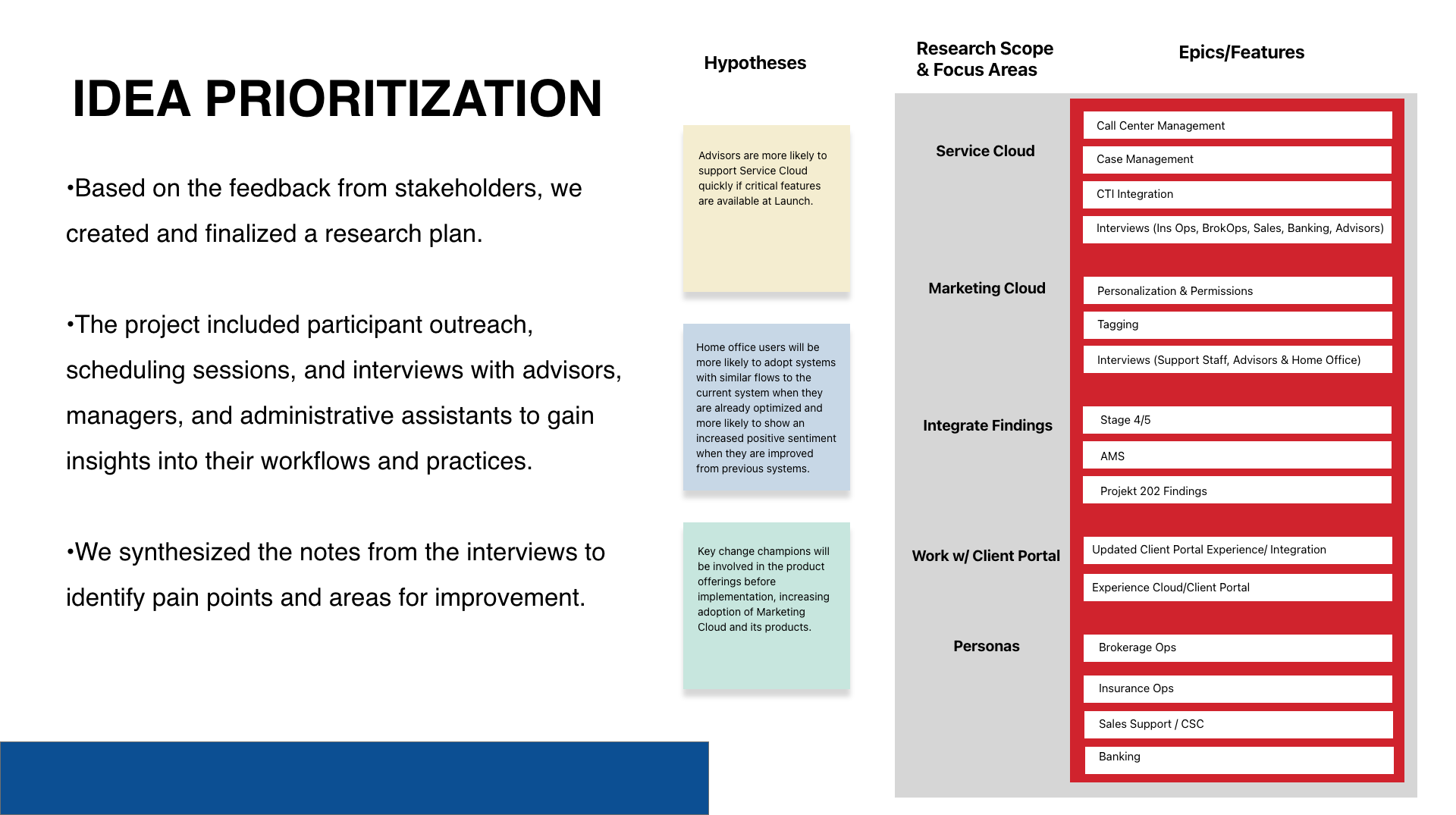
Idea prioritization map connecting stakeholder hypotheses, research scope, personas, and platform features
A research plan grounded in stakeholder hypotheses — mapping research scope, personas, and prioritized features across the platform.

Informational Architecture

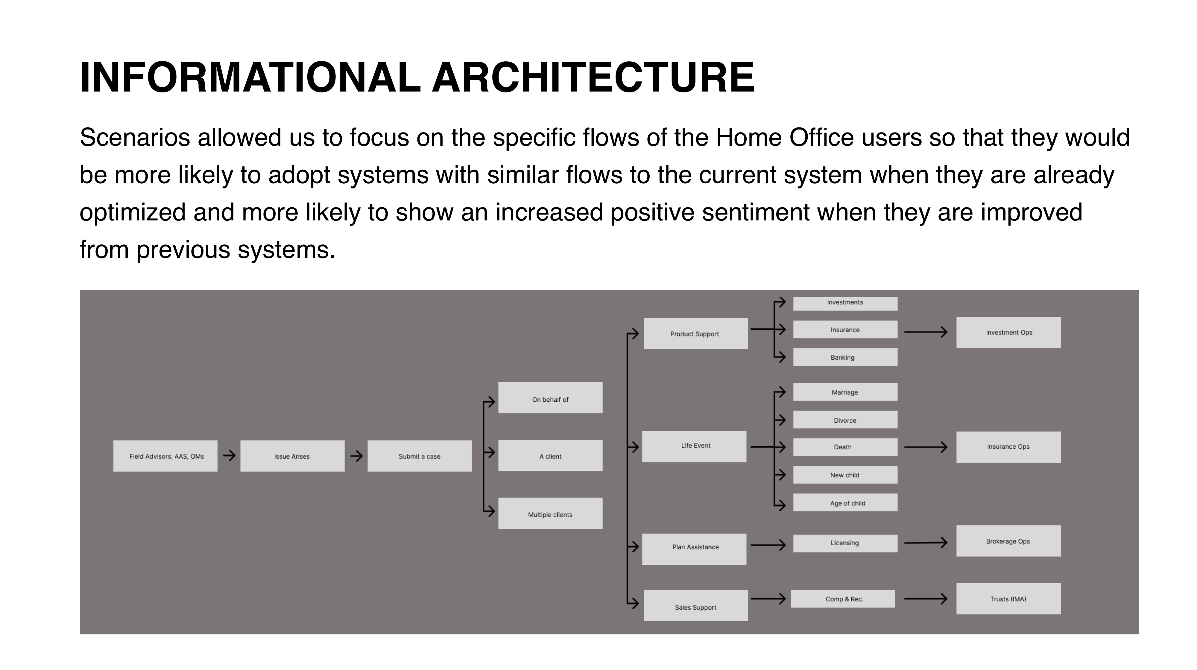
Informational architecture flow diagram tracing a case from submission through organizational teams
Mapping how a single case actually moved through the organization — surfacing exactly where advisors were losing time before it reached the right team.

Platform Interface

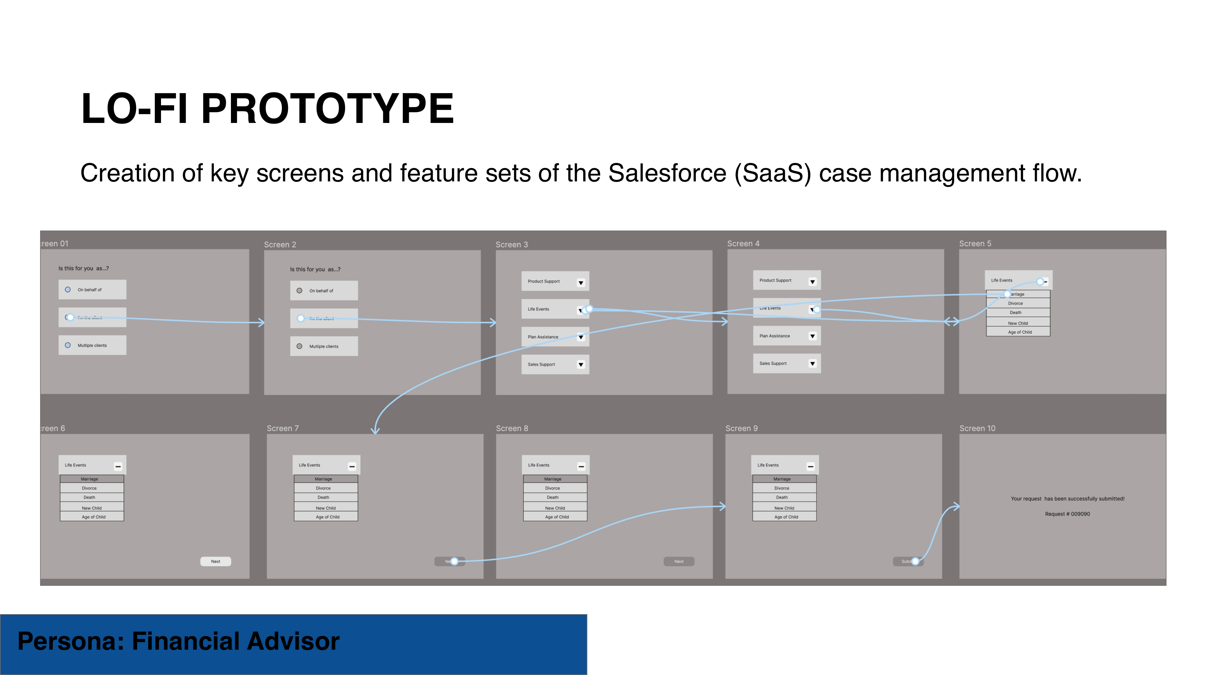
Salesforce Service Console case management interface prototype
The Service Console environment advisors used for daily case management — the interface at the center of the redesign.

Employee Journey Map

To understand where advisors were actually losing time, I mapped their end-to-end journey — from the moment a client issue arises to final resolution — separating what worked from what didn't before comparing it against the redesign.
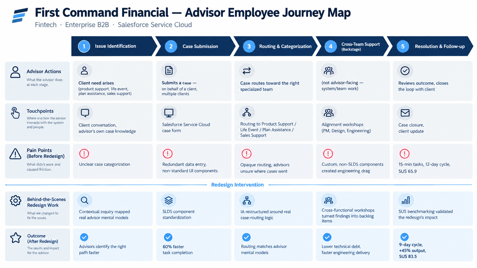
First Command Financial advisor employee journey map comparing the five stages of issue resolution before and after the redesign
Mapping the advisor journey from issue to resolution — surfacing exactly where friction lived, and how the redesign closed each gap.

Field Notes

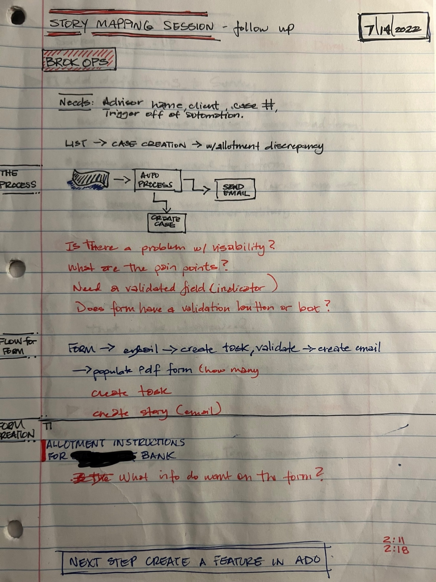
Before any of this was designed, it started with handwritten notes — real interview prep, workflow sketches, and open questions from working sessions with the team.
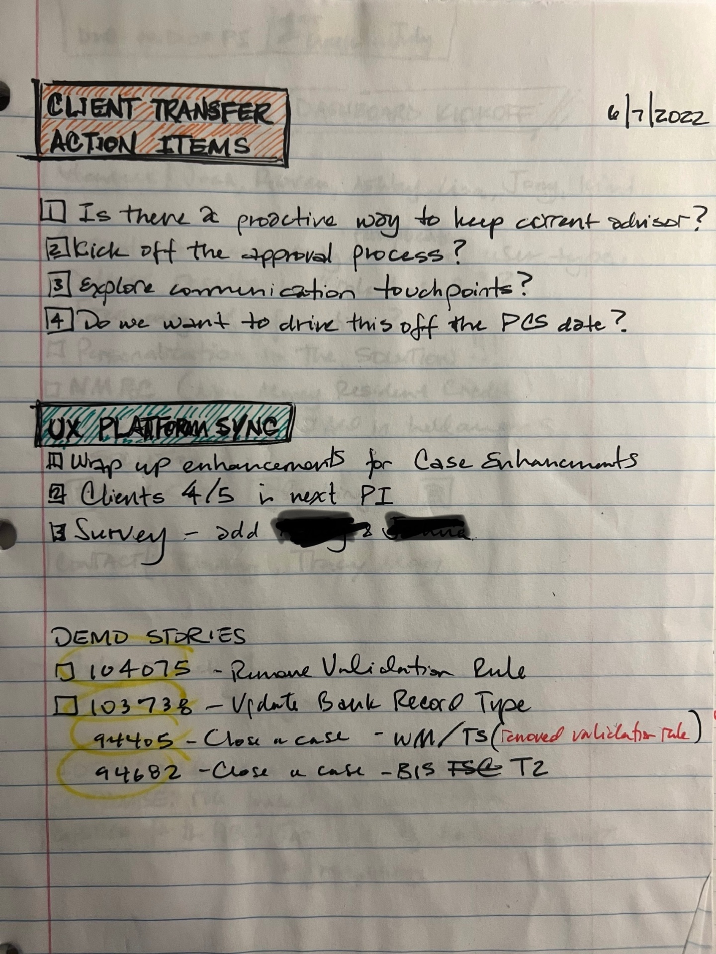
Handwritten client transfer action items on lined notebook paper, dated 6/7/2022, listing open questions about advisor retention, approval process, and communication touchpoints
Early planning notes on the client-transfer workflow — surfacing open questions about advisor retention, approval flow, and communication touchpoints before any design work began.
Handwritten story mapping session follow-up notes on lined notebook paper, dated 7/14/2022, with a flowchart for automated case creation and red-ink usability questions
Mapping the automated case-creation flow step by step, then stress-testing it against real usability questions — is there a validation indicator, does the form need a confirmation step — before building anything.
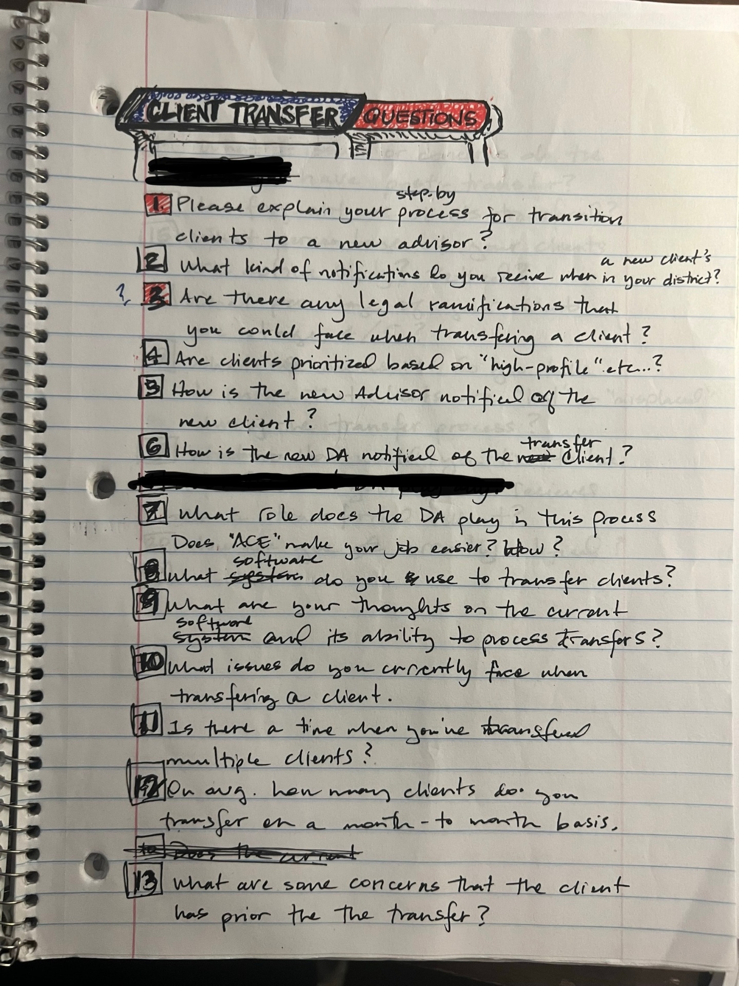
Handwritten client transfer interview questions on lined notebook paper, prepared for direct advisor conversations about friction in the current process
The actual interview guide used to talk with advisors directly — questions built to surface real friction: legal risk, notification gaps, and what advisors wished the current process did differently.

Results

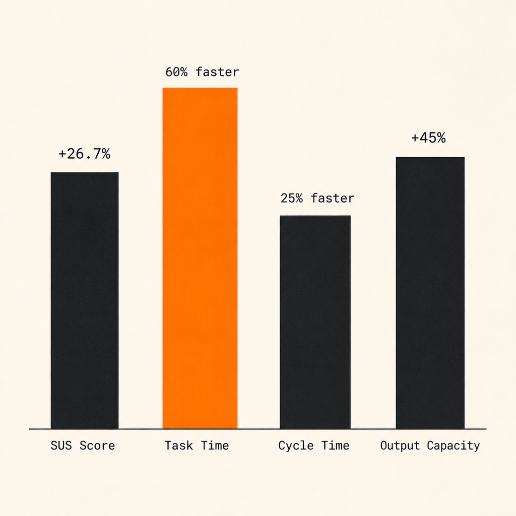
65.9 → 83.5
SUS score
System Usability Scale
60%
Task completion time reduction
15 min → 6 min
25%
Onboarding cycle-time reduction
12 days → 9 days
45%
Advisor daily capacity increase
4.0 → 5.8 applications/day
Conceptual bar chart visualizing the four results metrics: SUS score, task time, cycle time, and output capacity
Conceptual visualization — recreated for portfolio purposes.

By eliminating redundant fields and standardizing the interface around SLDS, the redesign cut friction where it mattered most — turning a slow, error-prone onboarding process into one advisors could move through in a fraction of the time.

Methodology & Frameworks

Want to dive deeper into the research methodology used in this project? Check out my book, "The Ten Commandments of UX Design," or view my complete background on my Resume.